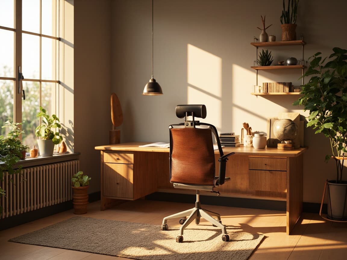
Google Display · Limited-time offer
Luxury worth coming back for
Take another look at craft, proportion, and material quality. Your saved favorites are still waiting.
Why this direction works
Reconnect the visitor with the same designer furniture in a more emotional lifestyle context. Keep promotional language secondary so the creative feels like a helpful reminder rather than a generic discount banner.
Channel execution
Adapt this idea for Google Display
The concept works because its hierarchy matches the job of the channel: earn attention, make the furniture legible, and give the viewer one sensible next step. Preserve that hierarchy when producing variations.
- Keep the product recognizable at small banner sizes and avoid placing copy over detailed upholstery.
- Match the visual to the product or collection the visitor previously viewed.
- Prepare short, medium, and long headline variants without changing the core promise.
Furniture accuracy
Check before publishing
Let material, joinery, finish, and proportion carry the message. Use restrained copy and generous negative space so the creative does not undermine premium positioning.
Compare the final creative with the source product image at full size. Confirm shape, color, materials, included pieces, promotion dates, landing-page message, and mobile crop. If any visual detail could change a purchase decision, correct it before the campaign goes live.